

Staring strictly at a single chart template is one of the most common pitfalls for developing market participants. It is incredibly easy to spot a beautiful buy setup on a five-minute view, only to realize too late that you just went long right into a massive daily resistance zone. Learning to zoom out and analyze the broader market landscape ensures your short-term setups align with the path of least resistance.
What exactly is multiple timeframe analysis?
Multiple timeframe analysis involves monitoring the same financial instrument across different candle granularities before pulling the trigger. Instead of relying on a single isolated perspective, you look at a combination of high-, medium-, and low-interval views.
Think of this process like checking a map before a road trip. The monthly or daily chart acts like a global satellite map, revealing major structural coastlines, mountain ranges, and highways. Your execution chart is more like a local GPS view showing individual street lanes and traffic lights. If you only look at the local street view, you might turn down a beautifully paved road without realizing it leads straight toward a collapsed bridge. By analyzing multiple intervals on a top platform provided by a high-quality best forex broker for mt5, you keep your trading direction aligned with global capital flows.
How many charts should I actually look at simultaneously?
A common mistake is suffering from analysis paralysis by loading up six or seven different intervals on your monitors. You do not need to overcomplicate the process to get a clear structural reading.
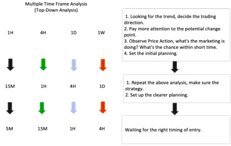
Sticking to a clean three-frame system keeps your perspective organized and highly actionable. Your highest view serves as your macro anchor, showing the dominant market trend and heavy institutional support or resistance zones. The middle interval acts as a transitional bridge, revealing the current internal market structure and multi-day value areas. Finally, your lowest interval functions exclusively as your tactical execution space, where you refine your entries and calculate your exact risk placement. This layered structure keeps your workflow efficient and ensures you do not get confused by conflicting micro-signals.
How do I combine these different intervals logically?
The trick to making this analysis work is moving sequentially from the top down, never the reverse. Start your session by opening your macro chart to determine which direction the big money is moving. If the daily trend is printing clear, aggressive higher highs and higher lows, you should ideally hunt for buy opportunities.
Once your structural bias is locked in, drop down to your intermediate view to locate a clear pullback or value zone. Finally, zoom into your execution frame to look for a micro-trigger, such as a candlestick rejection pattern or a structural break, that signals the pullback is ending. If you are just starting out with forex trading for beginners, maintaining this top-down sequence stops you from fighting the dominant tides of the market.
What should I do when my timeframes completely contradict each other?
It is perfectly normal to open your screens and find that your charts are telling completely different stories. The daily view might be in a brutal downtrend, while the hourly chart shows an aggressive, explosive rally.
When this conflict occurs, always default to the authority of the higher interval. A minor rally on a lower chart is often just a temporary pullback on a larger frame, meaning that short-term buying surge is highly likely to stall out the moment it hits a macro resistance line. If the discord between your timeframes looks incredibly messy or highly erratic, the safest choice is simply stepping aside to wait for a cleaner setup. You are under no obligation to trade a chaotic landscape; wait until the micro-movements align nicely with the broader structural picture.
Can this top-down approach help me manage my overall risk better?
Absolutely, and this is where the real commercial value of multi-frame execution shows up in your account balance. By sourcing your structural bias from a higher interval but timing your actual entry on a lower frame, you can drastically tighten your risk parameters.
A stop-loss placed on a daily chart requires a massive buffer to survive normal intraday fluctuations, which forces you to use much smaller position sizes. If you spot that exact same macro turning point but refine your entry trigger on a fifteen-minute chart, your stop-loss buffer shrinks dramatically. This tight alignment lets you maintain a safe, disciplined risk profile while maximizing your mathematical risk-to-reward potential on the trade. It allows your position to capture a massive multi-day swing while exposing your account balance to only a small fraction of micro-risk.
Practical Takeaway
Before clicking a single buy or sell market execution today, pull up a daily or four-hour chart of your target asset and mark the closest major historical support and resistance zones with thick horizontal lines. Drop down to your preferred execution frame and ensure your planned trade has plenty of open space to move before it collides with those macro boundaries. By building this multi-frame sanity check into your pre-trade checklist, you will filter out low-probability traps and ensure every trade you take has the full weight of the broader market trend backing your position.